Here’s a hard truth: most visitors decide whether to stay on your site or leave within three seconds. That’s all the time you get to make a first impression.
And in that short window, people aren’t reading every word or analyzing your layout. They’re looking for one thing—clarity.
What is this site about?
Can it help me?
Does it feel trustworthy?
If your website doesn’t answer those questions clearly and quickly, they’re gone.
Let’s look at how to make sure your site passes the 3-second test—and keeps people around long enough to convert.
What Are People Actually Looking For in 3 Seconds?
They’re not scanning your footer or digging through menus. They’re focused on your hero section and any visible calls to action.
Here’s what they want to understand immediately:
- Who you are
- What you do
- Why it matters to them
If that doesn’t come across clearly above the fold, they’ll bounce before they even scroll.
Common Reasons Sites Fail the Test
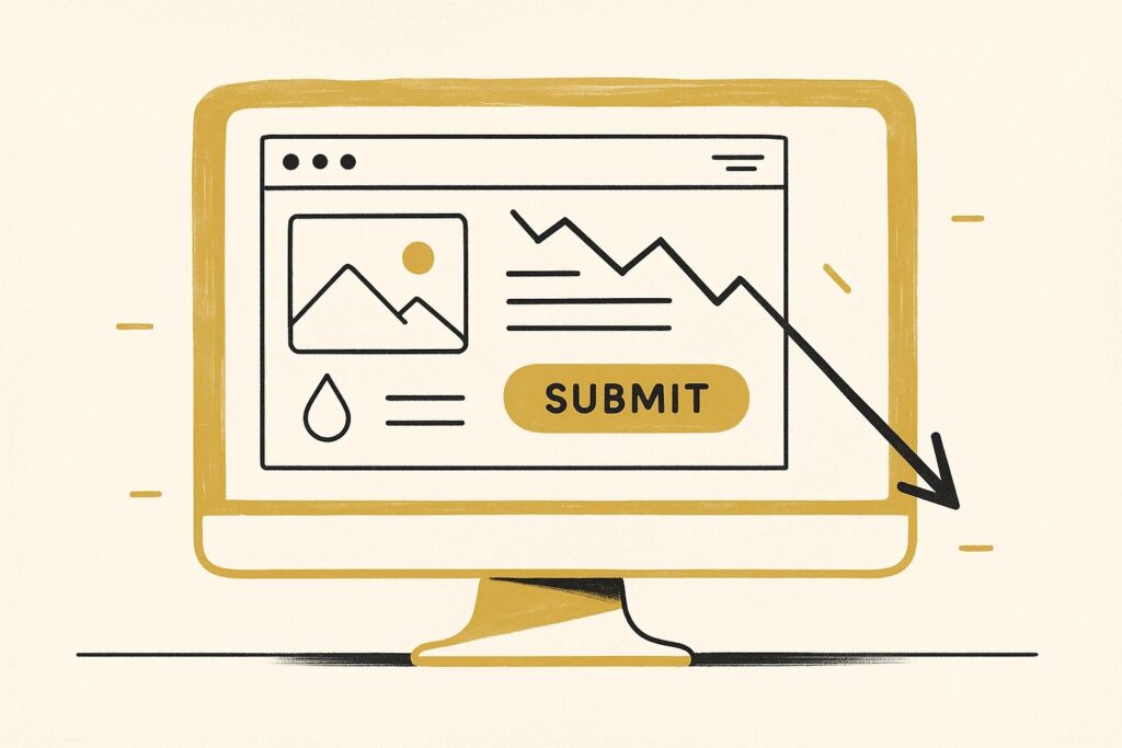
The most common culprit? Overdesigned or vague hero sections. You’ve likely seen it before—beautiful imagery, clever headline, but no clear explanation of what the business actually does.
Other common issues:
- Weak or missing CTAs
- No visual hierarchy
- Sliders or video backgrounds that distract from the message
- Mobile layouts that push important content too far down the page
Remember: people aren’t patient. If your site asks them to work too hard to understand what you offer, they’ll hit the back button.
How to Run the 3-Second Test on Your Own Site
Here’s how we do it during audits and redesigns:
- Open your homepage on a desktop and mobile screen.
- Without scrolling, set a timer for 3 seconds.
- Ask someone unfamiliar with your business:
- What does this company do?
- Who is it for?
- What should you do next?
If they hesitate or get it wrong, you’ve got a clarity problem.
How to Fix It (Without Redesigning Everything)
You don’t always need a full overhaul. Sometimes, small adjustments can make a big difference:
- Rewrite your headline to say what you actually do
- Clarify or reposition your CTA
- Reduce visual clutter and improve contrast
- Use subheadlines to add context
- Test your layout on mobile—especially that top section
The goal isn’t to say everything in 3 seconds. It’s to say enough to earn the next few seconds of attention.
Need a Second Set of Eyes?
We run this test (and a lot more) during every performance and UX audit we deliver. If you’re not sure whether your site is helping or hurting your conversions, we’ll show you exactly what to fix.
Run a Free Website Audit
Contact Us for a deeper review and recommendations.