Let’s be real, your homepage is the most valuable real estate on your entire website. It’s where most people land first, and it often determines whether they stick around… or bounce.
As someone who’s worked with hundreds of business owners, I see the same costly mistakes pop up again and again. The good news? They’re fixable, and once you address them, you’ll see better engagement, more leads, and a site that actually works for your business.
So here are the top five homepage mistakes, and what to do instead.
1. Trying to Say Everything at Once
Your homepage isn’t your business card, brochure, and sales pitch all rolled into one. But a lot of DIY websites treat it that way, cramming in every service, feature, and detail right at the top.
Why it’s a problem:
Visitors get overwhelmed. When everything is important, nothing is. You only have a few seconds to grab attention, if your homepage feels chaotic, users will leave.
Fix it:
Think of your homepage like a conversation starter. Lead with one clear value proposition and guide visitors to deeper pages where they can explore more. Keep your layout clean, with a clear visual hierarchy.
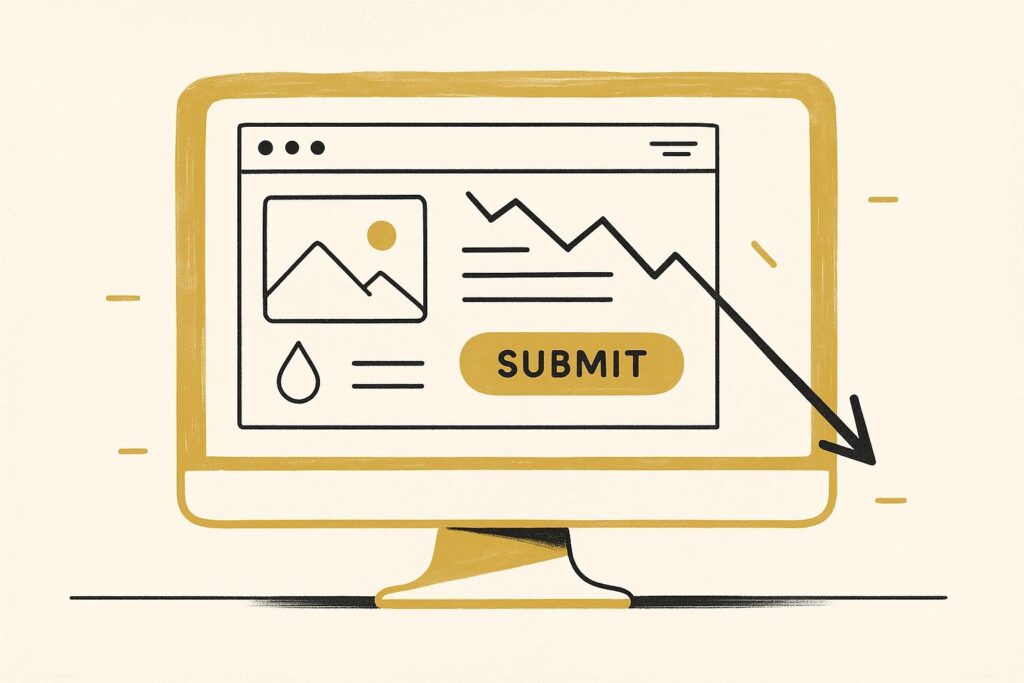
2. No Clear Call-to-Action (CTA)
What do you want people to do when they land on your site? If your answer is “learn more,” “scroll down,” or “figure it out,” then we’ve got a problem.
Why it’s a problem:
Without a clear CTA, visitors don’t know what to do next. And in most cases, they won’t gues, they’ll just leave.
Fix it:
Every homepage should include a strong, obvious CTA above the fold, whether it’s “Book a Call,” “Get a Free Quote,” or “Start Your Trial.” Use action verbs. Make the button stand out. And don’t be afraid to repeat your CTA in multiple spots as they scroll.
3. Weak or Vague Headline
Your headline is the first thing people see. If it’s generic like “Welcome to Our Website” or “We Build Solutions,” it’s not pulling its weight.
Why it’s a problem:
Your headline needs to answer a visitor’s question: “What is this and why should I care?” Vague language confuses users and kills conversions.
Fix it:
Write a headline that clearly states:
- What you do
- Who it’s for
- Why it matters
Example:
“Custom Home Remodeling for Rhode Island Families, Built to Last and Finished On Time.”
That’s clear. That’s compelling.
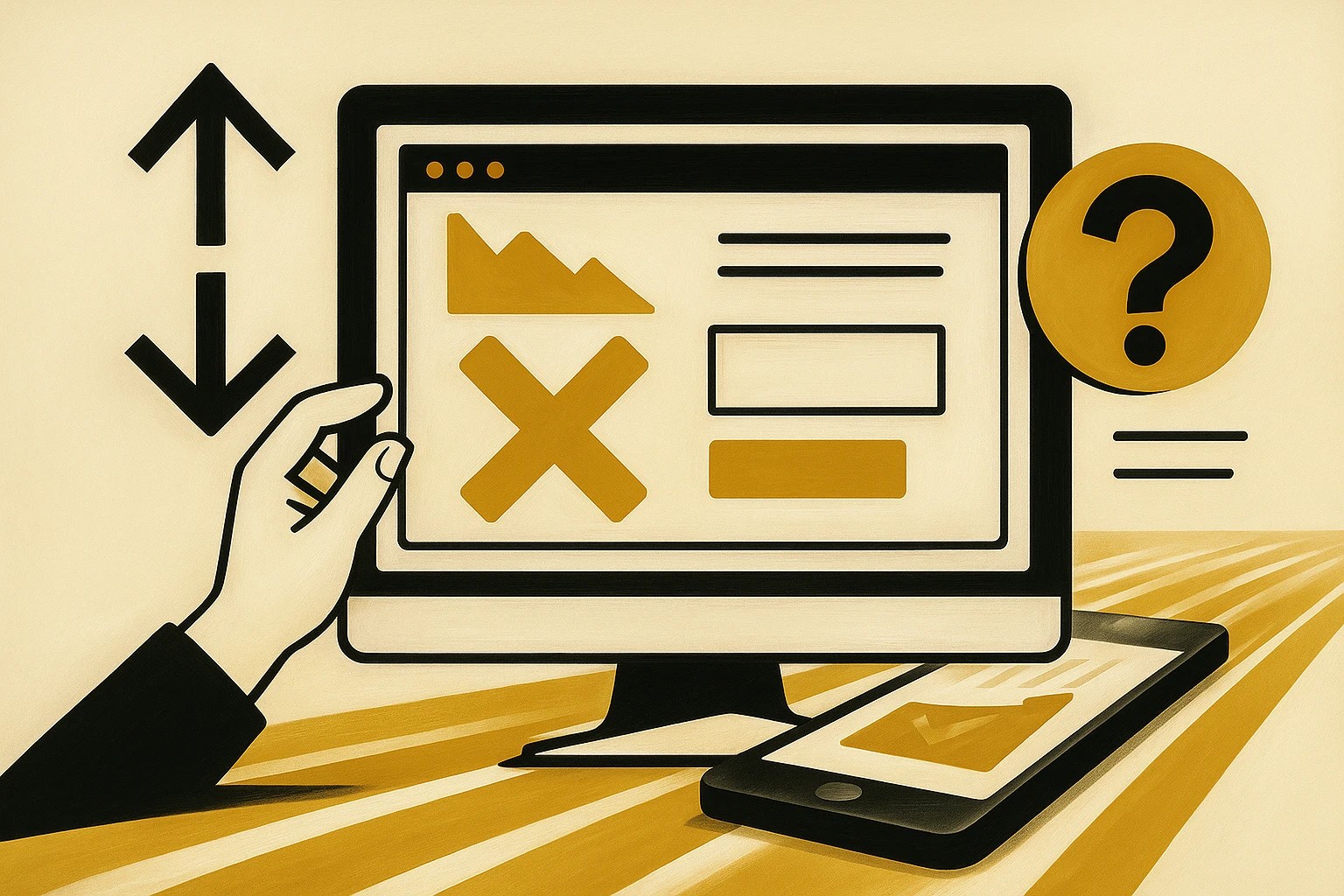
4. Ignoring Mobile Users
Over 60% of website traffic is now on mobile, but many homepages still feel like clunky desktop pages shoved into a small screen.
Why it’s a problem:
If your mobile experience is slow, cluttered, or hard to tap through, you’re alienating the majority of your audience.
Fix it:
- Use a mobile-responsive design
- Ensure buttons are easy to tap
- Keep hero images and copy short and to the point
- Test it yourself on multiple devices
Bonus: Use tools like Google’s Mobile-Friendly Test to make sure you’re hitting the mark.
5. No Proof or Credibility
Even if your service is amazing, nobody wants to be the first to take a chance. If you’re not showing trust signals on your homepage, you’re leaving money on the table.
Why it’s a problem:
People trust other people more than they trust brands. Without proof, you’ll lose leads to competitors who show they’re credible.
Fix it:
Add social proof like:
- Testimonials
- Client logos
- Case studies
- Awards
- Media mentions
- Google reviews
Place these close to your CTA to help push visitors across the finish line.
If your homepage isn’t working, you’re not alone, and you’re not stuck. These mistakes are common, but so are the fixes.
Here’s the bottom line:
Your homepage isn’t just a pretty page. It’s a strategic tool that should guide, engage, and convert. Treat it like your best salesperson, give it the tools to succeed.
Want a quick homepage audit? We’re happy to give you honest feedback and show you what to improve.