Your ecommerce site looks polished. The branding is consistent, the layout feels modern, and everything loads quickly. But sales? They’re nowhere near where they should be. If you’re scratching your head wondering why people aren’t buying, despite your site looking “just fine”, you’re not alone.
We’ve worked with countless online store owners who’ve been in your shoes. Here’s what we’ve found is often holding back conversions (and how to fix it).
Design Without Direction
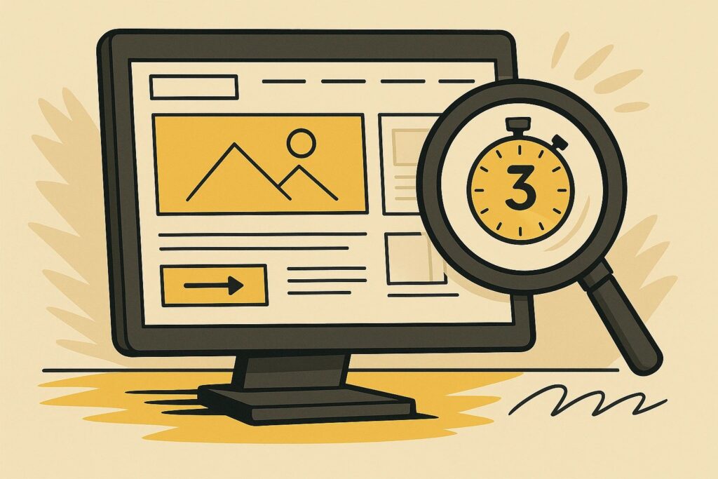
Good design isn’t about how sleek your site looks, it’s about guiding your visitor to take action. A common mistake is prioritizing style over strategy. When everything’s competing for attention, nothing wins.
“If your visitors can’t tell where to go next within three seconds, your design is failing your sales.”
What to do instead:
Establish a clear visual hierarchy. The product, offer, or next step should be unmistakable. Ask yourself: “Where does the eye go first?” If it’s not the CTA, rethink the layout.
Overloaded or Unclear Homepages
Your homepage shouldn’t be a dumping ground for everything you offer. If you’re trying to sell to everyone at once, you’ll end up connecting with no one.
“Clarity converts. Confusion causes clicks to die.”
Here’s the move:
Focus on one or two high-impact actions, like exploring a collection, signing up for a special offer, or highlighting your top seller. Keep it clean, purposeful, and conversion-focused.
Weak or Generic CTAs
“Learn More.” “Click Here.” These do nothing to move the needle. CTAs are your closer, they should be strong, direct, and benefit-driven.
“Every CTA is a chance to close. Don’t waste it on vague language.”
Try this instead:
Use phrases like “Get My Discount,” “Shop the Collection,” or “Secure Your Spot.” These not only clarify the action, they create urgency and value.
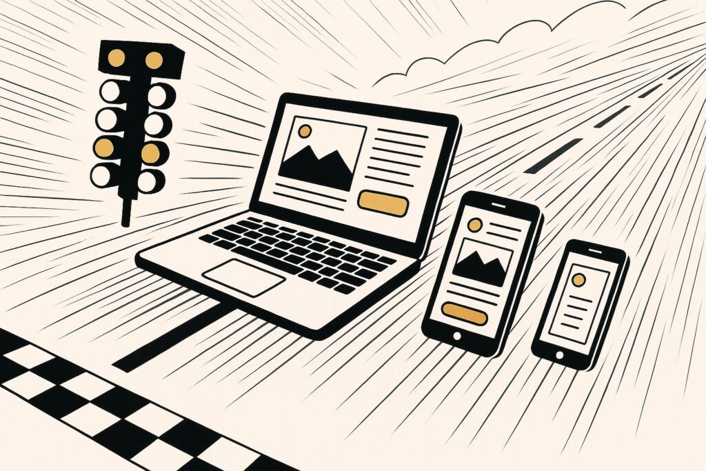
Mobile Experience Isn’t Optimized
Most traffic today is mobile-first, but many stores still treat mobile as an afterthought. Small tap targets, poor load times, or broken layouts on mobile will quietly kill your sales.
“A bad mobile experience is the fastest way to lose a sale in 2024.”
We recommend:
Test every key journey on mobile, not just desktop. Use tools like Google’s Mobile-Friendly Test or Hotjar to identify friction points and fix them fast.
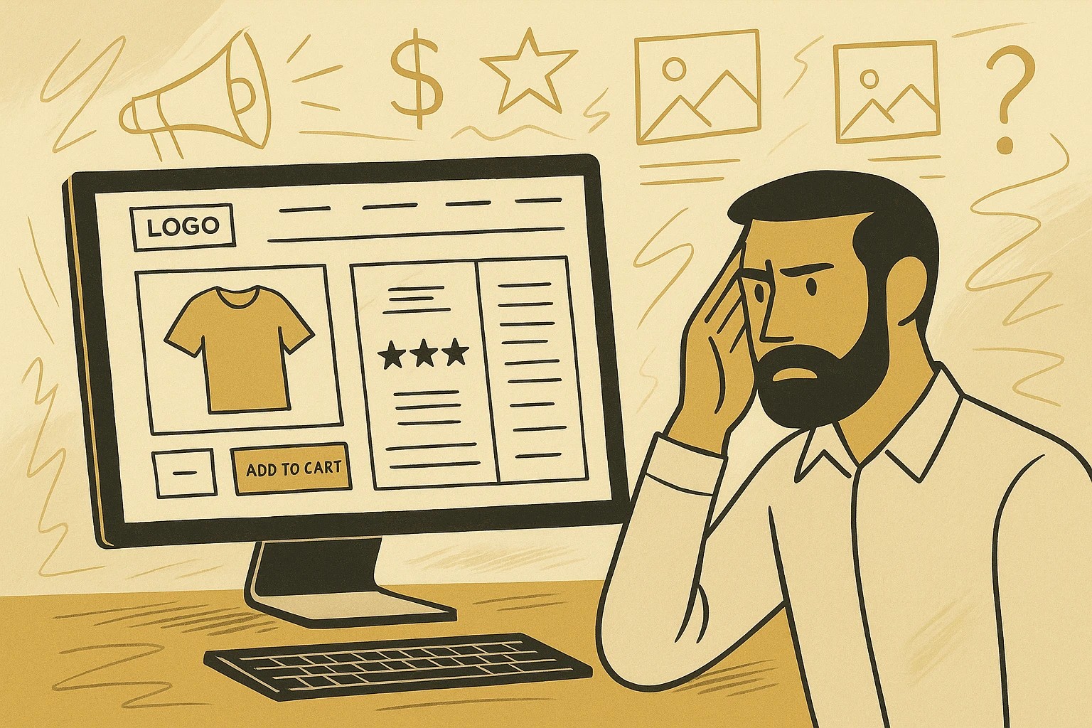
Missing Trust Signals
People don’t buy when they’re unsure. No matter how great your product is, if your site lacks trust elements, shoppers will hesitate, or leave altogether.
“If you don’t look credible at first glance, you’ve already lost the sale.”
What builds trust:
- Real, visible reviews
- Clear return and shipping policies
- Contact info and live chat availability
- Badges for secure checkout and accepted payment methods
- High-quality product photos (with zoom)
Unfocused Landing Pages
Sending traffic to your homepage instead of a dedicated landing page is like inviting someone to a store without showing them where to go. If you’re running ads or promos, each campaign should have its own purpose-built landing page.
“Great landing pages don’t just inform, they guide, persuade, and convert.”
Here’s why that matters:
A great landing page removes distractions and keeps the user on one clear path: learn, trust, convert. It’s one of the easiest ways to improve ROI without touching your ad budget.
We get it, your site might look good, but looks don’t always sell. Great ecommerce websites convert because they guide visitors, reduce hesitation, and make it easy to act. That means thinking beyond the surface and optimizing for what really matters: trust, clarity, and action. When you get those things right, the sales tend to follow.